Proptech collective
Redesigning the website for
Canada’s largest property technology community.
Proptech Collective is the largest property technology community in Canada. They connect industry professionals, founders entrepreneurs across the property technology sector. The collective hosts networking events such as happy hours and industry panels, authors an incredibly robust yearly report that offers an analysis of the proptech industry across Canada, and connects startups with potential funding resources.
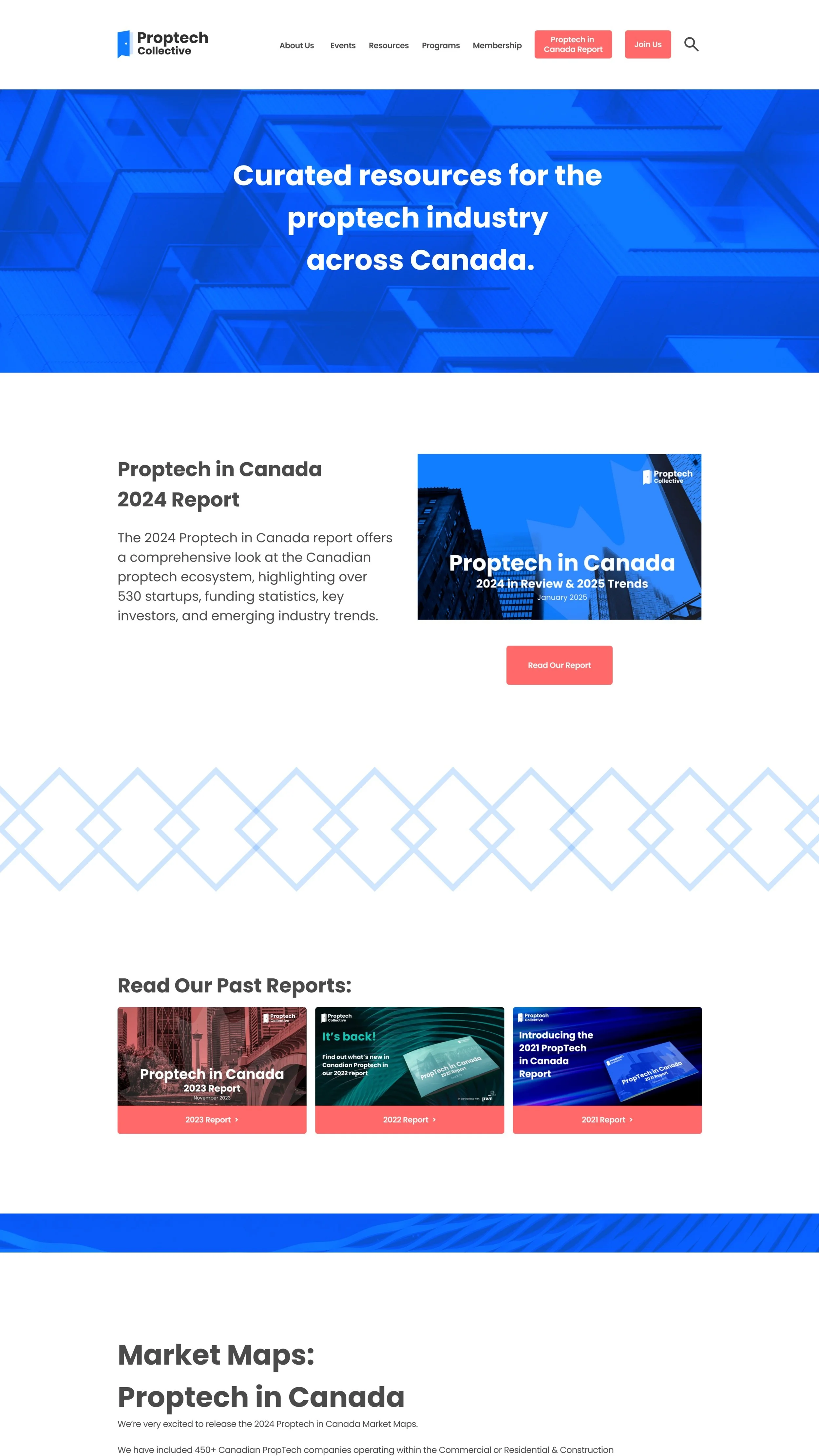
The current iteration of their website struggled to express the organization’s mission in a clear and concise way.
Our task was to create a new website where users could have a solid understanding of what Proptech Collective was about within the first minute of visiting the site.

The Task
Discover:
The Process
We began with a thorough discovery phase, peeling back the layers of their existing site to evaluate how users experienced it. Our heuristic evaluation uncovered several critical issues: dead links, confusing navigation, vague language, and missing or misleading content. The event section, for instance, didn’t exist as a native page on the website but redirected to an external site, disrupting the user’s journey.
To support our audit, we conducted interviews with both members and non-members of the Proptech Collective. Some had attended events but never officially joined; others were active in the community but didn’t know where to find essential resources. Many shared the same sentiment: while the organization was clearly valuable, its website failed to reflect that value.
Our discovery process also included comparative and competitive analysis of similar groups in the proptech environment, as well as robust assessment site map of the existing website which outlined clearly outlined to the client all of the dead links, and confusing or misleading navigation.
After affinity mapping and synthesizing user insights, a picture emerged of a typical user: Dave, a founder in the Proptech space. Dave saw the potential value in the community, but the website left him without a clear path to resources, events, or like-minded individuals. Without access to niche-specific insights or meaningful networking opportunities, he struggled to fully engage.
Defining the problem
Dave’s Problem statement:
Dave sees the potential value of Proptech Collective but struggles to fully engage and access its core benefits. His partial involvement creates an information gap, limiting his ability to navigate resources, events, and networking opportunities effectively.
Without a clear path to niche-specific insights, meaningful partnerships, and a supportive community, he finds it difficult to stay informed, build influence, and grow his business within the broader Proptech ecosystem.
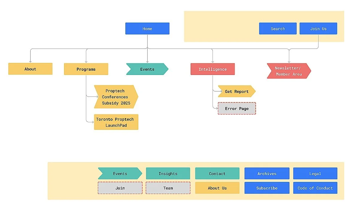
With clarity around the problem, we reimagined the site’s structure. We created a revised sitemap that placed emphasis on four primary content areas: Home, About, Events, and Resources. Each of these pages was designed to give users immediate, digestible value, whether that was learning about upcoming networking events or accessing a curated set of Proptech resources.
We sketched ideas, mapped out flows, and developed low-fidelity wireframes to validate our assumptions. As we moved into high-fidelity design, we paid close attention to branding, contrast, and visual hierarchy to ensure the experience felt both trustworthy and energizing. These wireframes were built to align seamlessly with the platforms Proptech Collective already uses, Squarespace, Luma, and Beehiiv, in order to make the maintenance of the site as smooth as possible.

Designing the solution

Testing
Before finalizing anything, we conducted usability tests and A/B comparisons to assess how real users navigated the updated interface. Our testing was based off three questions:
What is it? Who Are They? What is “the vibe”?
Their feedback confirmed our hunches: users felt more confident, found information more quickly, and understood the purpose of the organization right from the homepage.
Delivering the design
In addition to a complete redesign of the Home, About, Events, and Resources pages, our final deliverables to the client included a full site audit report, a new information architecture assessment, low and high-fidelity wireframes, and a thorough guide for integration into Squarespace.
Our redesign gave Proptech Collective a stronger platform that better reflects the actual value their community provides. By increasing the clarity of the website’s navigation and organization, Proptech Collective’s users, like Dave, can now more easily understand what Proptech Collective’s vision and mission are, and how they can reap those benefits.